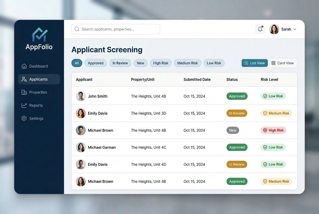
Screening felt risky, slow, and scattered across too many screens.
Property managers were juggling credit, criminal, and eviction reports across separate views, re-reading dense reports under time pressure, and second-guessing decisions that carry real legal and financial weight. Small teams were spending hours per applicant on a task that needed to happen in minutes — and mistakes here can mean fair-housing risk or a bad tenant.
Watching real managers screen real applicants.
I ran contextual interviews and screen-recorded sessions with property managers ranging from single-building owners to regional portfolio managers. The pattern was consistent: everyone built their own ad-hoc checklist outside the product — sticky notes, spreadsheets, mental math — because the tool itself didn't surface a clear recommendation.
- Managers wanted a single, scannable view of risk — not five reports to cross-reference.
- Compliance language needed to be visible in the moment, not buried in a help article.
- Teams needed an audit trail showing how and why a decision was made.
Figma wireframes — upon request
One decision panel, plain-language flags, and a clear paper trail.
We consolidated credit, criminal, and eviction data into a single applicant summary with a plain-language risk snapshot at the top — not a black-box "score," but transparent flags a manager could inspect and understand. Every flag linked back to the underlying report detail, so nothing was hidden behind the summary.
We also built a lightweight, editable decision log: the system pre-filled the criteria a manager reviewed, and let them add a note explaining their decision, creating a defensible audit trail without adding extra work.
Testing for speed under real pressure, not just clarity on a static screen.
Because the real-world task happens under time pressure with legal stakes, usability testing wasn't just "can they find it" — it was timed, scenario-based tasks with realistic (fictional) applicant data, including edge cases like thin credit files and old, resolved eviction records. We iterated the flag hierarchy twice after testing surfaced that managers were fixating on old, resolved issues instead of current risk.
Faster decisions, fewer second-guesses.
- Median time-to-decision dropped significantly in usability testing compared to the existing multi-tab workflow.
- Every test participant could explain why the tool flagged an applicant, without additional guidance.
- The decision log gave compliance and support teams a clear record to reference during disputes.
This project reinforced something I keep coming back to: in high-stakes workflows, clarity is a compliance feature, not just a design nicety.